Mortality Rates in Alberta

Preamble
The Covid-19 pandemic has held the world in its grip for two years now. Just in time for its second anniversary, the virus has mutated into yet another variant with a greatly increased infectiousness, and is spreading throughout the population at rates never seen before. At the same time, scientists and public health officials are monitoring for reports of a reduced severity of illness from this variant, and to what extent this might at least partially dampen the strain on the health care system.
While the assessment of the “infectiousness-vs.-severity” question is still in its infancy — and may only ever become truly accurate in hindsight —, it has already become abundantly clear that the previously-used metric of infection case numbers fails to be a good instrument this time around. Only half a month into this new wave, we are already seeing cases so drastically outnumber previous waves of the pandemic that it is truly dizzying. (The ever-sarcastic tone of the internet has already deemed the curve of case numbers to be flattened, just along the wrong axis of the graph.) Naturally, the focus is shifting towards hospitalization rates as a more direct measure of the strain imposed on the most crucial public resources. Time will tell whether we might be looking at a cataclysmic turn of events to put everything before to shame; or perhaps a transition into an endemic illness and the beginning of the end of the “new normal” that we all have and haven’t gotten used to; or something else entirely.
Besides case numbers, hospitalization rates, and ICU occupancy, there is yet another metric of judging the most severe outcomes of this global health crisis: Mortality rates. Granted, the devastation that the SARS-CoV-2 virus brings on an individual level is not just restricted to this worst one of outcomes, but may otherwise entail crippling and potentially life-long aftereffects in survivors. Nonetheless, even though the chance of death from an infection may be low in comparison to other viruses,1 it is a compelling “bottom-line” metric to investigate. And while we may debate back and forth about the extent of under-testing and under-reporting, lags in hospitalization rates and the unknowns of Long Covid, assessing mortality rates affords us to take a step back and gauge the impact of the pandemic in a particularly striking (and sobering) way.
After all, death does not lie.
Alberta Mortality Rates 2010–2021
Data Collection and Preparation
Mortality data for the province of Alberta is available through the IHDA web portal2, categorized by age groups and gender. As of 06-Jan-2022, data is available from January 2010 through November 2021. Since the number of total records is rather small (1,716), we can comfortably do all of this analysis in Excel.
First, the data is downloaded separately for each one of the finer age groups (0 to 19, 20 to 39, 40 to 64, 65 to 74, 75 to 84, 85+) to avoid hitting the 500-record limit that the website imposes for single queries. In a next step, these separate data are then consolidated into one file. In this data, we find the following fields:
Sex: female or male;Age: the age group as outlined above;Month: a timestamp of the formYYYYMM;Mortality Rate: the mortality rate as deaths per (100,000 population / month) for the given time frame;Deaths: the raw number of deaths recorded in the given time frame;Population: monthly “Person-Years” figures, calculated as the total population (based on quarterly-updated estimates) divided by 12;Standard Error: error estimate based on assuming a Poisson distribution.
Once all the data is combined, we can rename the Month field to Timestamp and split it up into two new fields, Year, Month No. and Month (where the latter is now the name of the month instead of its number).3 We are left with the data in “long format”, ready to be aggregated and put to further use.
Aggregation
Within the raw data, the total number of deaths in each age bracket and for each sex, (\(D_\mathrm{a,s}\)). is related to the respective “person-years” population (\(P_\mathrm{a,s}\)) and the calculated mortality rate (\(m_\mathrm{a,s}\)) as \(m_\mathrm{a,s} = D_\mathrm{a,s} / P_\mathrm{a,s}\). The total mortality rate for the entire population, \(m_\mathrm{tot}\), can be calculated as \(m_\mathrm{tot} = D_\mathrm{tot} / P_\mathrm{tot} = \sum{D_\mathrm{a,s}} / \sum{P_\mathrm{a,s}}\), where the summation runs over all age brackets and both sexes in the data.4
Our goal is to produce a graph that shows the averaged mortality rates for the pre-pandemic years 2010 and 2019 in comparison with the explicit data for 2020 and 2021. To add more context to the averaged pre-pandemic data, we also want to include some information on how strongly those previous data fluctuated; for this purpose, we will show an interval based on the standard deviation calculated from the data for those 10 years. If we make this interval 3 times the standard deviation, then almost 100% of the previously observed values will be within this band.
To bring the data into the required form, we run it through a series of Pivot Tables. First, the death counts and population estimates are aggregated by summing over the sex and age categories, and subsequently used to calculate the mortality rate. This mortality data can then be pivoted out into the given years and months, and the data for 2010 through 2019 can be averaged and its standard deviation calculated.
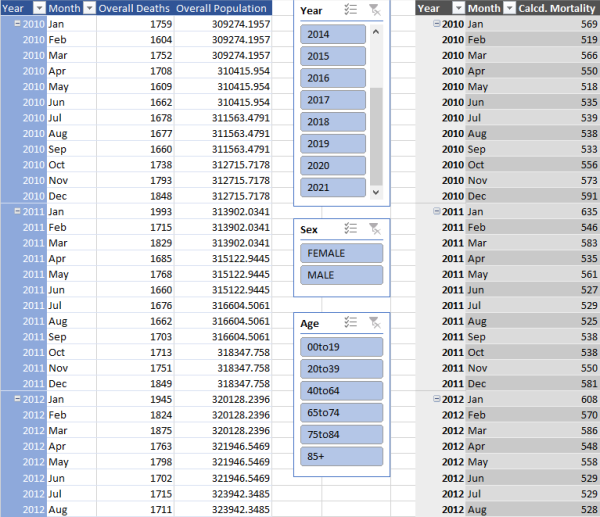
Intermediary pivot tables (with slicers) created from the raw data. These tables are then further aggregated to yield the overall monthly data.
Visualization and Interpretation
Let’s visualize the data with Plotly in Python.5 In the figure below, the grey line shows the average mortality in Alberta from 2010 to 2019, with the shaded area being ±3 standard deviations. The orange and red curves are the data for 2020 and 2021.
Comparison of average mortality rates between pre-pandemic years (2010–2019), 2020, and 2021.
The purpose of choosing 3 standard deviations for the width of the grey band is to indicate the entire range of mortality observations from those previous years.6 With this pre-pandemic data in hand, there are some crucial observations that we can make:
-
For the first two months of 2020, the mortality data still aligns with that of the previous decade. Starting with March 2020, however, the mortality increases beyond any previously observed rate. We can use this as a rough measure for the “start date” of the pandemic.
-
Most importantly, only two months during the pandemic (May 2020 and February 2021) show mortality rates that are compatible with the previous decade. All other data exceeds the historic baseline, some of it by a quite drastic margin.
-
The strongest deviations in the data occur in the months of September and October 2021 — the time frame of the spread of the Delta variant of the virus.
Comparison with Reported Cases and Deaths
Another interesting comparison to make is that between the mortality data and the specific Covid case numbers and deaths reported by Alberta Health in their “Summary Data”.7
Comparison of mortality rates for 2020 and 2021 with reported Covid case numbers and deaths
Again, two points stand out in these curves:
-
The Covid-related deaths and the overall mortality data are in strikingly close agreement throughout the entire pandemic. In other terms, the overall mortality data and the reported Covid deaths are very well compatible with each other; assuming that the mortality data itself is robust and that no deaths have been ignored, there is no obvious sign of any over- or underreporting of Covid fatalities.
-
The third wave of the pandemic around April 2021 is marked by a notable increase in case numbers, but without an accompanying spike in deaths.
Conclusions
The overall mortality rate in Alberta between 2010 and 2021 is a striking tool to visualize (and re-confirm) the impact that the Covid-19 pandemic has had, and continues to have, on the population. While this worst of outcomes is not the only burden that we all have to shoulder due to this virus, it is certainly one of the most harrowing and striking ones. The data shows, unambiguously, that the pandemic has led to a noticeable increase in deaths across the province when compared to the baseline data of the preceding decade, and suggests that these deaths have been appropriately attributed to Covid in the official records.
At the time of writing, the Omicron variant is leading to unprecedented infection rates throughout the province and, indeed, the whole world. Time will tell whether our hopes and wishes for this wave to be the “beginning of the end” of the pandemic will finally come true.
-
See, for example, https://en.wikipedia.org/wiki/List_of_human_disease_case_fatality_rates ↩
-
From the front page: “Go to the IHDA Data” → “Enter IHDA Data” → “Mortality” → “Mortality Rates - Monthly” ↩
-
Note that \(D\) and \(P\) have to be summed individually, not as their fractions, since \(m_\mathrm{tot} \ne \sum{m_\mathrm{a,s}}\). ↩
-
Assuming a normal distribution of the underlying data, 3 standard deviations cover 99.7% of the distribution. ↩
-
Data shown here as of 10-Jan-2022 ↩